Digital maps serve as effective tools when it comes to managing emergency situations like epidemics.
Dr. John Snow (do not confuse it with the King beyond the wall) is considered to be the first to use typical Geographic Information Systems tools to analyze an emergency situation. The English doctor determined, after making a spatial analysis of the infection cases of cholera, that the cholera outbreak that occurred in London in 1854 was due to the spread through contaminated wells.
Before he created his revolutionary map, people believed that cholera spreads around by miasma in the air.
It is considered that this was the beginning of GIS in epidemiology. We encourage you to learn more about its history.
Following the outbreak of COVID-19 (a type of coronavirus originating from China in late 2019), numerous maps and web viewers that collect the state of the pandemic in real time have emerged. In this post we are going to show you some of them.
1. Coronavirus COVID-19 Global Cases by the Center for Systems Science and Engineering (CSSE) at Johns Hopkins University (JHU)
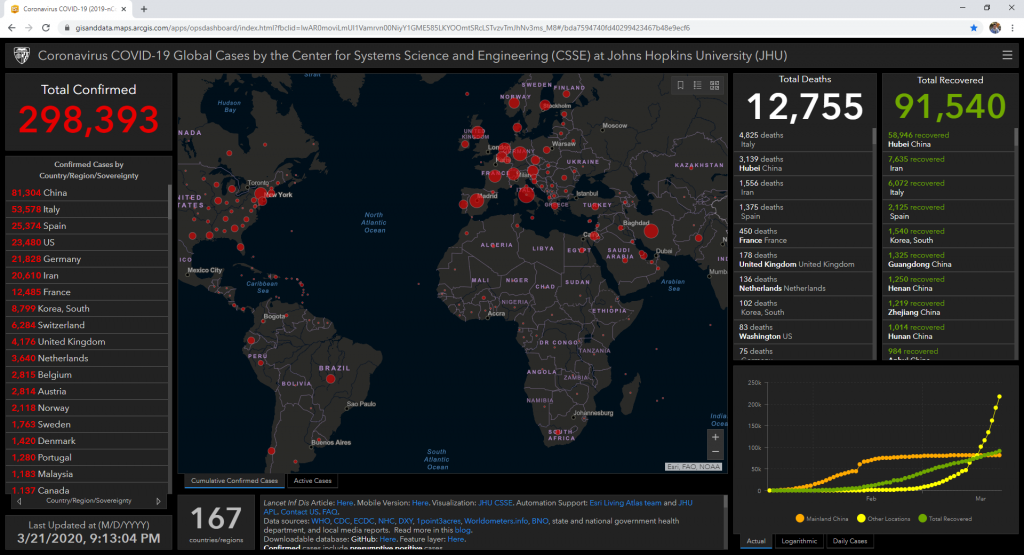
LINK – https://gisanddata.maps.arcgis.com/apps/opsdashboard/index.html
One of the first web viewers developed as a result of the spread of COVID-19 and, perhaps, the most complete of all, is the one developed by the John Hopkins University in the United States. It shows a complete dashboard with lists, charts and maps of confirmed cases. In addition to the infected population, it also includes cases of recovery and death by country and date.
This viewer is built using ESRI’s ArcGIS Online platform, and collects information from numerous official sources. It has two great advantages:
The data is updated almost in real time (they show more recent updates than some of the sources they use).
The information is openly available on your GitHub for everyone, so anyone can download it and create their own maps and analysis.
2. World Health Organization – Novel Coronavirus (COVID-19) Situation
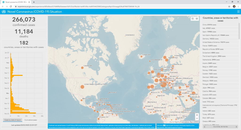
LINK – https://experience.arcgis.com/experience/
Following a similar scheme to the previous one, the World Health Organization has published its own online viewer with the status of COVID-19. It also uses the ESRI platform to display a dashboard with the current status of the pandemic. It uses data collected by the WHO itself and updates the data several times a day.
3. European Centre for Disease Prevention and Control
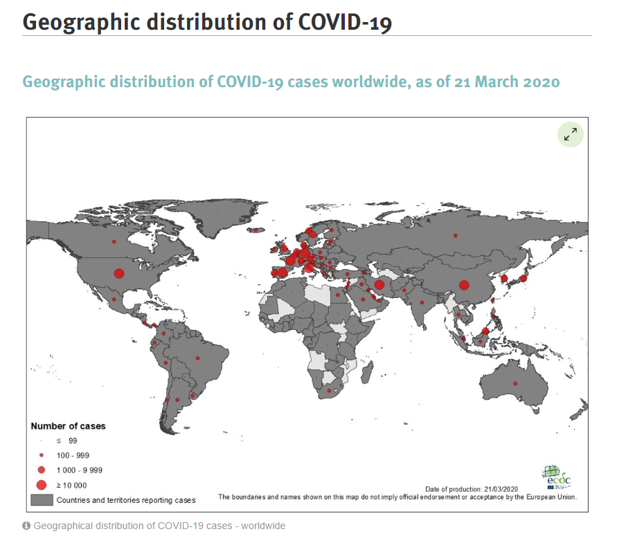
LINK – https://www.ecdc.europa.eu/en/geographical-distribution-2019-ncov-cases
Although it is not an interactive viewer as in the previous cases, the European Union, through CEPCE, has launched a website that shows the current situation of COVID-19 globally. It displays the information in the form of tables, graphs and maps, and is updated daily. As a point in favor, there is the possibility of easily downloading the data in EXCEL format.
If you know more COVID-19 viewers and sources of spatial information, do not hesitate to leave them in the comments.


 (3 votes, average: 2.33 de 5)
![]() Loading...
Loading...
Quality training taught by professionals


OTHER SOURCES:


Leave A Comment